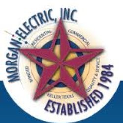
Recently, Morgan Electric called upon Moon and Owl to redesign their small business logo and their website. After having the same logo since 1984, an overhaul was desired.
Business Logo Design: Where to Start
Creating a logo for your business may seem like a challenging task for the non-creatively inclined owner. A good graphic designer will help you first understand the purpose of your logo and how it can complement your brand.
We worked with a small business in Fort Worth, Morgan Electric, to create a logo that can stay with them for a long time. We know that a logo has to be workable in multiple mediums, on their website, signage, print, billboards, events, vehicles and more. Your logo is the “visual mascot” of your business. It is the symbol that people will quickly identify with your brand. With all that amount of exposure, you’d better not just like your logo. You’d better LOVE it!
Morgan Electric Before and After
Morgan Electric’s logo had been adequate for them for since 1983. However, it was very complex, not easily legible and definitely needed an upgrade. It also quickly lost recognition when placed in a black & white or gray-scale presentation.
Moon and Owl listened to owner Ronnie Morgan, and we quickly understood the deep sense of Texas pride that saturated him and this Dallas-Fort Worth Company.
They had originally thought they’d merely use MEI (short for Morgan Electric, Inc.) on their logo, but in our research people who were already very familiar with this Keller, TX iconic company didn’t recognize the MEI shortening of the name. In fact, everyone tends to call them “Morgan Electric.”
The client agreed to keep his name in the longer form. We wanted something that worked in a simpler color scheme, including gray-scale and black & white.
Previous Logo

Morgan Electric Logo Created by Moon & Owl

Works well in grayscale, too.

This new small business logo clearly states both the company name and reinforces the rich heritage of Texas ownership. The client is extremely happy and is getting very positive feedback from their commercial and residential customers.
When Designing a Small Business Logo, Remember
1. Simpler logos are typically better.
Keep your logo clean and simple. Too much clutter, color, and text can be distracting and unattractive. they All the extras will detract from your objective, being remembered. Develop a brand color palette and focus on one, two, or three colors that fit your brand. Don’t select a random symbol. Find one that connects to something unique about your relevance to your customers and to the products or services you offer.
2. Reinforce the tone and persona of your business in your logo.
Your business has a “tone” or a persona to it. No one is going to want to trust a high-authority-needed business (think physician, lawyer, etc.) to a business with a quirky, cartoonish logo. You want certain businesses to emanate steadfast professionalism.
On the other hand, some businesses are quirky, fun and lite and your logo design should reflect that fact.
3. Differentiate from your competitors.
Take the time to look at your competitors’ logos. Make sure your logo sets you apart from your competitors in no uncertain terms. But to do so don’t violate #2 above.
4. Avoid symbol only logos if you are a newer business.
Yes, Nike, McDonalds, and Apple can get away with a symbol only logo. Most likely, you aren’t there yet. These companies have spent millions on brand recognition and have earned the right to drop the print version of their name and still have you recognize them. While this is where we all want to end up in business don’t start this way.
Ideally, you’ll pick a symbol and type fonts that are unique enough that, one day, should you achieve such a milestone as these major companies, you’ll be able to go symbol only if you want to. Keep in mind, giants like IBM, Ford, and others have kept the type font (word version) logos of their names throughout their existence.
5. The more colors, the more the logo will cost.
That rainbow gradient logo might look great on your computer screen, but when you the printer quotes you the cost of full 4 color process printing on a piece that could have been two colors if only your logo would submit to such a rendering, you’ll be not nearly as excited. Each color will cost more in print.
In fact, make your designer show you a grayscale and black and white version of the logo so you can see how it translates.
5. Be picky about the final file format in which your logo is delivered.
We’ve had people call us who had a designer design a logo and deliver it to them in a moderately sized jpeg. Then that organization wanted to use the logo on a large billboard or print piece and the logo gets grainy and pixelated (ugly). They then panic when they cannot reach the original designer.
While we can recreate your original logo for you, you shouldn’t have to do this and unfortunately, we do have to charge for these services.
A properly delivered logo file comes in a vector form, which is a fancy graphic design way of saying it can be expanded or shrunk by a designer with zero amounts of degradation of the image. Sure you can have them send you a .tif, .jpeg, or .png file too but make SURE you get a vectorized file (.ai, etc.).
If you need help with your small business logo design, branding, or messaging, call us at 817-889-1487. We’ll be glad to sit down, listen to your needs, and help design a stunning logo.
