
“Yes, your site will be mobile friendly.”
Any good web designer will tell you that. But your next question as a business owner should be, “Do you design mobile first and should my site be designed mobile first or not?”
Getting the answer to this question answered correctly can increase revenue. Getting it wrong can leave money on the table because of a less than optimal experience visitors have on your website.
This article isn’t written for web designers, but for you, the business owner, to help you understand what type of site you need and what to talk to your website designer about.
What is Mobile First Web Design?
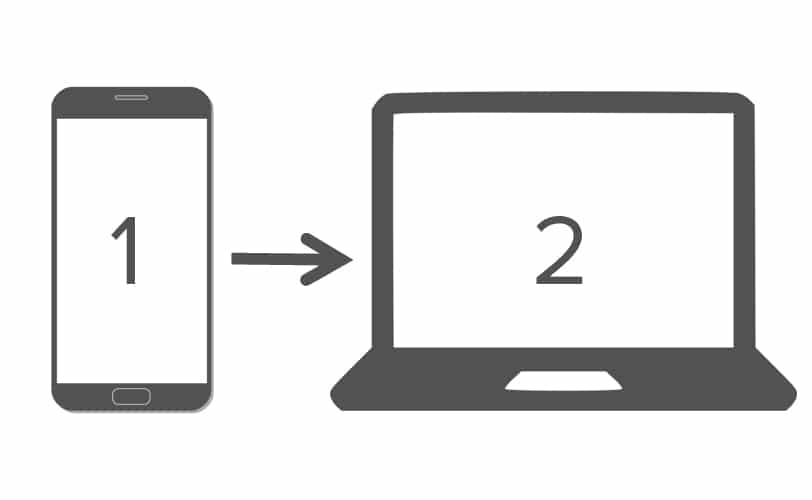
In the “old days” (aka the early days of the smartphone), all web designers would create a beautiful site for desktop and then think, “Okay, how are we also going to make this look good on mobile?” Then they would create the responsive design of the site for small-screen devices. It’s not wrong, it’s just the way everyone designed back then, partly because the viewership on mobile was small and it was a newer medium.
Not anymore.
When you need a new website for your business, you now need to make a decision about whether your site will be Mobile First designed or Desktop First designed. (Note: When we say desktop, we also mean laptop. It really means a larger screen with a horizontal orientation versus a smaller with a vertical orientation.)
Mobile sites tend to have more restrictions. For example, the clickable button on a mobile site has to be large enough that the end-user can click it easily. On a desktop, this isn’t an issue.
Why is Mobile First Design Important?
More and more people will visit your site on their mobile. This is a general trend and is expected to grow. Your site needs to function well in a mobile environment.
In 2012, smartphone sales overtook PC sales. Obviously, that correlates with more people using smartphones to search the web.
However, that doesn’t mean it is true for your website. You need to know the truth about your website’s viewers.
How Do I Know The Mobile Versus Desktop Viewer Stats on My Site?
You can know the trends for your own website if you have Google Analytics installed.
Go to your Google Analytics homepage dashboard by logging in at https://google.com/analytics
Look at your home Google Analytics dashboard for a section called What Are Your Top Devices. It looks like this:
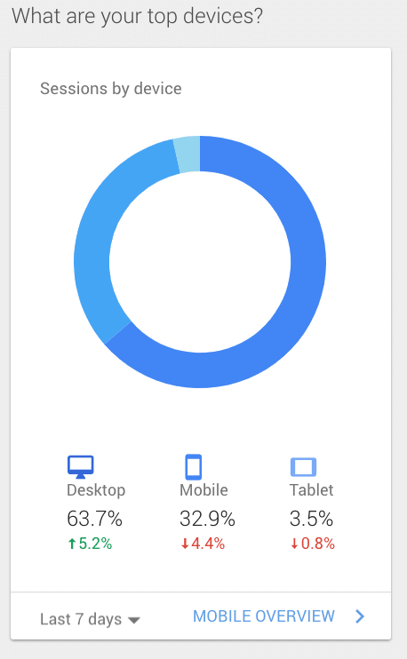
Click on that area and you’ll be given more detail.
You can change the date filter to see how your mobile versus desktop viewership has changed over time. Typically, we see a growing trend toward mobile, especially if views are compared Quarter-to-Quarter or Year-to-Year.
In general, we are consistently seeing a trend toward greater mobile viewership. However, this depends on the audience your site is targeting (see below).
Why is it important to know whether people are viewing more on desktop or more on mobile?
Because you want to design first to the device on which the majority of online visitors view your site.
All designers must make choices. Your site should look fantastic on desktop and mobile. However, it will still be slightly design optimized to look and work a wee bit better on one platform than the other. This is not just a Moon & Owl Marketing approach. The desktop first versus mobile first choice is innate and requires that every designer has to make some decisions which render the appearance and effectiveness a tiny bit better on one platform versus the other. The key question is, does desktop or responsive design come first.
Here is a general rule of thumb. The more business-to-business (B2B) your site’s audience is, the more desktop views you will have. The more consumer oriented (B2C) your site is, the more mobile viewers you will have.
Notice the difference between these two examples.
B2B Website | Desktop Usage Heavy
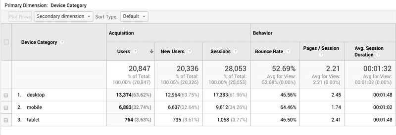
This B2B site has much heavier desktop usage.
B2C Website | Mobile Usage Heavy
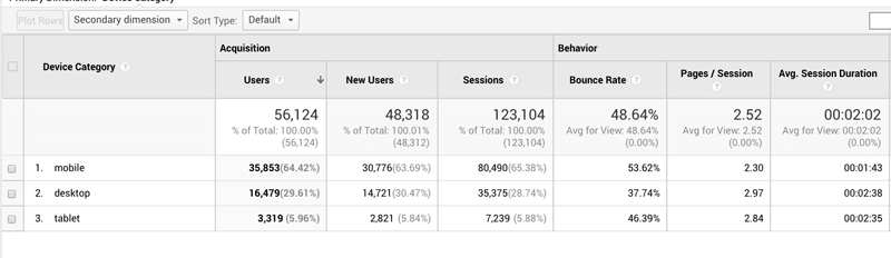
This B2C site has much higher mobile views.
This makes sense. Think about how you use the Internet.
You look at different sites at work on your PC than you do when surfing on your phone. Everyone follows this pattern.
So if you have a heavily oriented B2B website, it should be designed desktop first if 70% of your traffic is arriving via desktop/laptop.
If you sell a fun product or lifestyle product (fashion, décor, fitness, etc.), or perhaps have a blog or passion-based content site (like The Pioneer Woman and her almost cult like following), you should definitely have your website designed to be Mobile First.
Is mobile first website design important for search results and SEO?
On March 26, 2018, Google announced it is making the mobile version your site the dominant way it will index your site (how it breaks out the presentation of your site in search including which pages are listed in ther SERPs).
And while this is new, be assured, your mobile site, rather than desktop, is the site version Google is most using to determine both your site’s content and index it.
While the Google powers that be currently say mobile first isn’t yet affecting ranking. Trust us, this isn’t active yet, but it’s coming soon.
This means the Google smartphone bot, and not the desktop bot, will be most utilized. (Don’t think of bot as R2D2 or CP3O. It’s automated software agents, called code, that crawls your website to discover what is on it.)
The better optimized your site is for mobile, the better it will ultimately rank on Google. And keep in mind, user searches from a smartphone and user searches from a desktop often return different results.
If you do have a large percentage of mobile users, ask your designer if they incorporate something called AMP (accelerated mobile pages). To learn more about AMP, click here.
When you design for desktop first and then approach mobile design, the design principle is called graceful degradation.
When you start with mobile first, your designer is forced to boil down the site to the most essential features for a great user experience. Then, he or she can do additions that add non-essential value for the desktop user.
These are enhancing additions but do not change the core functionality and conversion optimization of your site. Often designers call this progressive enhancement.
If most of your traffic arrives on mobile, it is better to expand a small-screen designed mobile site than to constrict a large-screen design down to a small screen.
But, for the web designer, it is also less fun as they must consider the constricting elements of mobile before setting off on the less restrictive wild-west of desktop version. Many designers don’t like doing mobile first design because they feel it limits their artistic creativity.
It’s much easier for them to design a mind-blowing desktop experience and then dumb-it-down to mobile.
But the primary job of your designer isn’t to have fun or be artistic.
A web designer’s priority is to design your business a website that converts viewers to customers, patients, and clients on the device on which they arrive.
How does mobile first affect the actual design of my business site?
Your website should look beautiful (or cool, or luxurious, or kitschy or whatever reinforces your brand) but its PRIMARY goal is to deliver content to the end-user.
Mobile first design tends to be content-centric. The written copy of your site is clearly presented for end-users. While your site will still look great, any distracting elements (landscape photos, hover-over buttons, etc.) will not be present.
The design process is the same:
- Target Audience Definition – clearly knowing who is the desired end-user.
- Foundational SEO & Strategy Work (keyword research, user intent, etc.)
- Content List / Sitemap – the outline of your content.
- Copywriting – writing the content for your site.
- Wireframe Creation – the blueprint or skeleton of how your site will lay out on mobile.
- Mock-up – the color rendition of your homepage and internal pages.
- Coding – turning the mock-up into working pages and merging in the written content.
- Desktop Design – modification of design to add enhancing elements for the desktop.
- Testing – ensuring everything is functioning at 100%
- Launch – taking the site live at the active URL.
Does starting with mobile first design mean my desktop experience will be inferior?
No. Your desktop can have further enhancements off the solid foundation of your mobile responsive design. Nor do the experiences of your website viewer have to be exactly the same. Content and basic functionality should remain the same, but each design can be adjusted to take advantage of the native capabilities of each device.
If your data reveals that the same user is accessing your site on BOTH mobile and desktop, you do want to ensure your designer makes the user experience (UX) similar by not varying the user interface (UI) too much.
Here is an example of a simple enhancement on desktop…
In the presentation, what is a bulleted item on your mobile might work better as a chart on a desktop
Is consideration given on how humans interface with each device differently?
The approach and ergonomic element (how the human body, in this case, the hand) interacts with the device is a crucial consideration.
The look and layout of your site need to make logical sense, but it also needs to make ergonomic sense.
For example…
A user on a cellphone uses his or her thumb to navigate. This means the call to actions and/or actionable item on a website needs to sit near the position of the dominant thumb – near the bottom of the screen. Their thumb will also be obscuring the screen partially as they interface.
On a laptop or computer monitor, they will most likely be using a mouse which doesn’t obscure the screen. But with a mouse, you don’t want to require one click on the right side of the screen with the next click on the left side of the screen followed by a third on the right. This is to much “travel time” for the mouse, and the user will get frustrated.
Now compound this fact that many new laptops and monitors are actually touchscreens. Things can get complicated quickly.
Separating the Discount Designers from the Professional Designer
An experienced web design agency, like Moon & Owl Marketing, will weigh all things in your web design.
This is what separates the great designers from the discount designers who make “pretty websites.” Mobile first considerations, ergonomic considerations, and other criteria all go into your site planning and design.
Your Business Owner Action Checklist
- Know your website visitor percentages of smartphone vs. tablet vs. desktop/laptop devices.
- Decide based on this data if a mobile first website is needed.
- Evaluate the functionality of your mobile page. Be critical of your own site. We’ll even give you a free evaluation if you call us. 817-889-1487.
- Determine if you need a site refresh or redesign that is mobile first.
If Needed, Make the Change or Update
Remember, your website is a digital asset. It’s not carved in stone and can be updated. If you see a majority of your viewers are on mobile yet your site was not designed to be mobile, it’s time to switch to a mobile-first design approach.
We are available to help advise you and provide design, redesign + development on a business website for your company that converts viewers to customers, clients and patients. Call us for a free consultation at 817-889-1487.