It’s 2018. Your site should reflect that.
Fortunately, your website is built out of pixels and not stone, so it’s easy to modernize and update.
What should your web designer be considering in 2018? We’ve gathered some of the best articles on the topic here.
Take a look at these lists and then a gander at your site. What needs to change? What can stay the same?
An out of date site implies and out of touch business to your visitors. It really is a virtual storefront. Just like you wouldn’t want a shoddy office or store, don’t settle for a shoddy website.
Web Design Trends 2018
The Death of Hard Right Angles
Back in the day square was your only option…
That’s changed in a big, big way in 2017. Now, every app from Google Now to Twitter to Facebook boasts almost aggressively rounded corners on their cards, input boxes, profile avatars, and more.

Read more design trends at https://webflow.com/blog/19-web-design-trends-for-2018
Semi-Flat Design
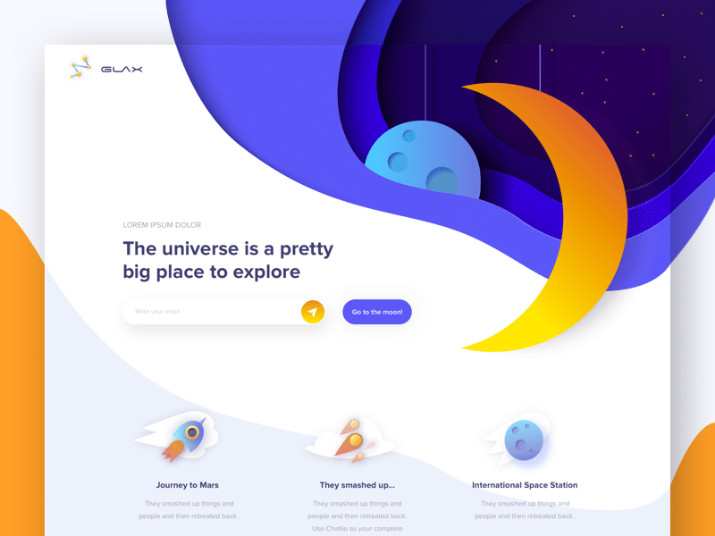
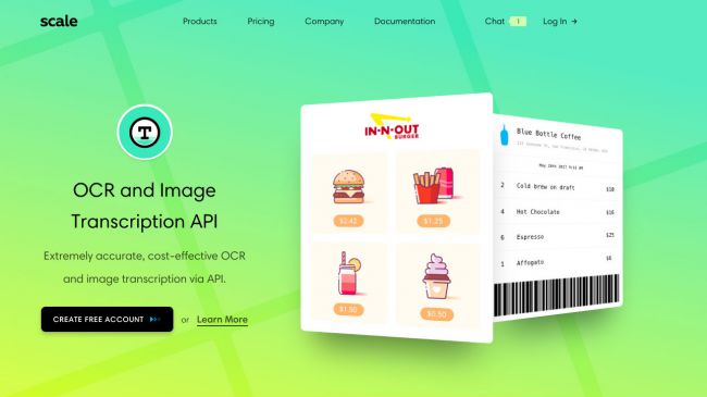
Remember when everything had a drop shadow, and then it didn’t. Now we are in the in-between.
“This new, so-called Flat 2.0 or semi-flat design, relies on adding nuance and depth to its prior ascetic identity. How is it doing that? By indulging in a few design taboos: gradients and shadows. But don’t worry, it’s only in moderation.”

Read more about 2018 design trends at https://www.creativebloq.com/features/web-design-trends
Asymmetrical Design
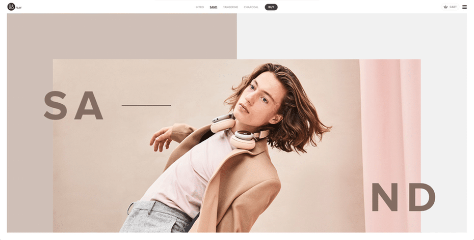
Long gone are the days of everything centered. Nature isn’t symmetrical and your site doesn’t have to be either.
One big change in 2017 was the introduction of asymmetrical and unconventional ‘broken’ layouts, and this web trend will still be going strong in 2018. The appeal of the asymmetrical layout is that it is unique, distinctive and sometimes experimental.

Read the rest of this web design trends article at https://99designs.com/blog/trends/web-design-trends-2018/
More Negative Space (aka Whitespace)
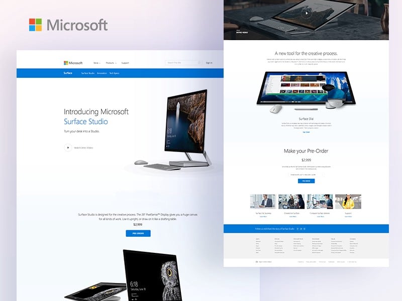
Putting in ample whitespace or negative space draws the users eye to that element on the page. Perfect for when you want to feature a product or highlight something in your portfolio. It’s wise to tie this to a clickable action.
Web Designers continue to use lots of negative spaces. Blank space force a user to look a something that’s unique. Guess What? You got it, it’s none other than your product for sale with an optimized CTA.

Read the other trends at https://medium.muz.li/web-design-trends-2018-a9bfabc99d46
Your Fort Worth Web Design Agency of Choice
At Moon & Owl, we stay abreast of the latest website design trends. We also test them to ensure they are the best converting option for your site. At the end of the day, your site needs to convert visitors to customers, clients, and patients. We test relentlessly. We’ll buck fads if needed. Conversion drives our design decisions. This means more money in your pocket.
If you need a Fort Worth Web Designer, we’d love to assist you. Contact us for a free consultation.
